Print quality is one of those phrases that sounds simple until you try to make a large photograph. A file can look beautiful on your monitor and disappoint on paper, while a modest camera can produce a lovely print when the image is sharp, properly prepared, and matched to the right surface. After years of testing sensors and lenses, I have learned that print quality is rarely determined by one impressive specification. It is the result of several ordinary decisions working together.
What print quality really means
Print quality describes how convincingly a physical print reproduces the detail, tones, color, and texture in your photograph. That includes more than resolution. A technically sharp image can still look flat if its shadows are blocked, highlights are clipped, or the printer cannot reproduce its saturated colors. A softer image can feel successful when the subject, light, and paper support its character.
The first variable is capture quality. Focus should land where you intend, shutter speed should prevent movement blur, and exposure should preserve important highlights. A full-frame Sony a7 IV, Fujifilm X-T5, or Canon EOS R6 Mark II gives you plenty of usable data, but none of those bodies can rescue a badly missed focus point. A clean file from a smaller Micro Four Thirds camera can produce excellent wall art at a normal viewing distance.
Resolution matters most when you crop heavily or print large. A 24-megapixel file is usually comfortable for an 8-by-10-inch or 12-by-18-inch print. A 40- or 61-megapixel file gives you more room for cropping, but it does not automatically create better print quality. More pixels can reveal lens flaws, camera shake, and distracting noise just as clearly as they reveal feather detail.
DPI, PPI, and the size of your file
People often use DPI and PPI interchangeably, but they describe different things. PPI means pixels per inch and refers to the image file. DPI means dots per inch and refers to the tiny ink droplets a printer places on paper. When preparing a photograph, the practical question is usually how many pixels you have for the intended print dimensions.
For example, a 6,000-by-4,000-pixel image printed at 12 by 8 inches works out to 500 PPI. That gives the printer plenty of information. Printed at 30 by 20 inches, the same file provides 200 PPI, which can still look very good when viewed from several feet away. A gallery print is not normally inspected with your nose against the surface.
Do not enlarge a file merely to make the PPI number look tidy. Upsampling can help a print workflow, and tools such as Adobe Lightroom, Photoshop, or dedicated software like Topaz Photo AI can produce useful results, but invented detail is still an estimate. Start with a properly exposed file, apply careful sharpening, and judge the result at the distance where it will actually hang.
Paper changes the photograph
Paper has a larger visual effect than many new photographers expect. Glossy paper can deliver deep blacks, crisp detail, and vivid color, but it also reflects lamps and windows. Luster paper offers some of that punch with a less distracting surface, which is why it is a dependable choice for family photographs, portraits, and general portfolios. Matte paper reduces reflections and gives a softer, more tactile presentation, although blacks usually appear less deep.
A monochrome street photograph may gain atmosphere on a textured cotton rag paper. A colorful sunset can look more energetic on a smooth luster or glossy surface. Neither choice is universally superior. The paper should support the image rather than compete with it.
This is also where print quality becomes personal. The same file can look overly sharp on glossy paper and beautifully restrained on matte paper. If you are ordering from a lab, download its ICC profile when available. That profile helps color-managed software preview how the paper and printer combination may render your file. It is not magic, but it is more reliable than guessing from a bright, uncalibrated laptop screen.
Sharpening and color management
Sharpening for a print is different from sharpening for a phone screen. Paper scatters light, so a print often benefits from a little more output sharpening than an online image. Apply it after resizing, and inspect a small test print before committing to a 24-by-36-inch enlargement. Excessive sharpening creates bright halos around branches, hair, and building edges.
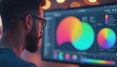
Color management sounds intimidating, but the basic sequence is straightforward. Keep your monitor reasonably calibrated, edit in a sensible color space such as sRGB or Adobe RGB, convert to the lab's profile when instructed, and avoid sending an image through several untracked conversions. If the lab requests sRGB, use sRGB. A wider color space is not automatically better when the entire workflow cannot display or print it consistently.
Print quality improves when you make a soft proof: a screen preview that simulates the paper and printer profile. Look for muted blues, compressed shadows, and skin tones that shift too warm or too cool. Make a separate print version rather than damaging your master file.

A practical test before a large order
Before spending $80 to $200 on a large fine-art print, make a small proof. Crop a section containing fine hair, fabric, foliage, or distant lettering. Include a skin tone or neutral gray if those appear in the final composition. Print that section at the same approximate scale as the finished work, then view it under ordinary room lighting.
If detail looks crunchy, reduce sharpening. If the shadows look empty, lift them slightly, but do not flatten the whole image. If colors seem dull, first check whether the paper is matte and whether your monitor was much brighter than the room. A test print is cheaper than learning these lessons on a framed enlargement.
For a client portrait, I usually inspect the eyes, eyelashes, hair edges, and smooth skin transitions. For a landscape, I check foliage, sky gradients, and small highlights on water. Those details reveal more about print quality than a dramatic close-up of a camera's sensor specifications.
Choosing equipment with the final print in mind
Buy resolution when your work genuinely needs it: large exhibition pieces, aggressive crops, commercial layouts, or detailed artwork. Otherwise, prioritize a lens you can focus accurately, a camera that handles the light you commonly shoot, and a stable workflow. A sharp 35mm prime may improve your results more than replacing a capable camera body. A tripod, controlled lighting, and careful editing can be even more valuable.
Ask the lab about maximum file dimensions, accepted color profiles, border requirements, and paper choices before exporting. Labs such as Bay Photo, WhiteWall, and Nations Photo Lab publish workflow information, while local professional labs may let you inspect paper samples in person. Prices vary by size and finish, but comparing a few sample packs is usually money well spent.
The best camera is the one you understand. The same is true of printing. When you know how resolution, viewing distance, paper, sharpening, and color interact, print quality stops being a mysterious upgrade contest. It becomes a repeatable process: make a sound capture, prepare the file carefully, test a small section, and choose the surface that lets the photograph speak.