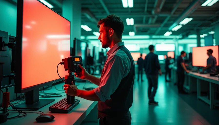
Colorimeter display calibration is one of those jobs photographers postpone until a print comes back looking strangely dark, orange, or flat. I understand the hesitation. The process involves unfamiliar terms, software prompts, and a small device that looks like a plastic puck. But once you understand what it measures, calibration becomes a short, repeatable part of your editing routine.
A calibrated display does not make every photograph perfect. It gives you a trustworthy reference. When your monitor shows a neutral gray, accurate skin tones, and believable shadow detail, you can make decisions that survive export, printing, and viewing on other reasonably adjusted screens. The best camera is the one you understand; the same is true of the display connected to it.
What a colorimeter actually does
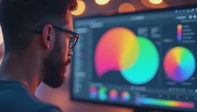
A colorimeter is a measurement device that sits against your monitor. It reads patches of red, green, blue, white, and gray displayed by calibration software, then compares those readings with expected values. The software creates an ICC profile, which is a small file that tells your operating system and color-managed applications how your display behaves.
That is different from simply turning down brightness until the screen looks comfortable. Your eyes adapt quickly to a bright or cool monitor, especially in a store or sunny room. A colorimeter provides a repeatable measurement instead of relying on visual judgment. Models such as the Calibrite ColorChecker Display Pro and Datacolor Spyder X2 use this basic principle, although their software and supported features differ.
Colorimeter display calibration is most useful when you edit RAW files, prepare images for clients, make prints, or compare work across two monitors. If you only share small JPEGs casually, it is less urgent, but a reasonable baseline still makes editing less frustrating.
Prepare the room and monitor first
Calibration starts before you plug in the device. Let the monitor warm up for at least 20 to 30 minutes. Turn off automatic brightness modes, night-shift features, blue-light filters, and manufacturer presets that change the image during the day. Choose a normal or custom picture mode rather than a vivid mode designed to attract attention in a showroom.
Control the room light as well. You do not need a dark cave, but direct sunlight on the screen will make judging shadows difficult. A neutral desk lamp placed behind or beside the monitor is usually better than a bright colored bulb. Remove strong reflections, clean the panel, and position yourself so you view the display straight on.
Most calibration applications ask for a target white point, luminance, and gamma. For general photography, 6500K is a sensible starting white point, gamma 2.2 is standard for modern computers, and a luminance target around 100 to 120 cd/m² often works well in a controlled room. A bright studio may require a higher target, while a dim print-editing space may work better around 80 to 100 cd/m².
A straightforward calibration workflow
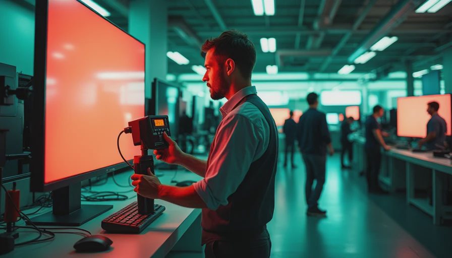
Install the colorimeter software, connect the device, and select the correct monitor if more than one display is attached. Place the sensor flat against the screen as instructed. Some devices use a counterweight over the back of the panel; others use a suction cup or a built-in hanging design. Do not press hard enough to damage a thin display.
The software will show colored patches while the sensor takes readings. During this stage, avoid moving the mouse over the measurement area and do not let the screen go to sleep. When prompted, adjust the monitor's brightness using its physical controls or operating system settings. Brightness is usually the one adjustment you make manually; the profile handles the display's color response afterward.
When the measurement ends, save the profile with a useful name, such as “BenQ SW270C March 2025” rather than “Profile 1.” Set it as the system default if the software does not do that automatically. Restart Lightroom Classic, Photoshop, Capture One, or your other editing application so it recognizes the new profile.
Colorimeter display calibration should be repeated when the monitor moves to a different room, receives a major firmware update, or begins to look noticeably different. For a stable home setup, every four to eight weeks is a practical schedule. Professional retouchers who need consistent proofing may calibrate more often.
How to tell whether the result is believable
After calibration, white should look neutral rather than blue or yellow, but do not expect the screen to look dramatically more colorful. In fact, a well-adjusted display can initially seem less exciting than a factory preset. That is usually because vivid modes exaggerate saturation and brightness.
Open a familiar photograph with skin, foliage, neutral clothing, and deep shadows. Look for smooth transitions in a grayscale gradient. If the darkest several patches merge into one black block, lower the room light or investigate the monitor's contrast settings. If shadows look lifted and gray, the display may be too bright, or the image itself may need attention.
For print work, soft proofing is the next step. A calibrated screen cannot predict paper behavior by itself. Paper white, ink limits, viewing light, and the printer profile all matter. In Photoshop or Lightroom, use the printer and paper ICC profile when available, then compare the simulated result without making the mistake of brightening every file to match a luminous screen.

Common mistakes that waste the effort
The most common mistake is calibrating once and then allowing the display to change afterward. Automatic brightness, True Tone, Night Shift, and gaming presets can override the conditions you measured. On Windows, confirm that the profile is assigned to the intended monitor. On macOS, check the Displays color profile after calibration and keep the same display connection when possible.
Another mistake is chasing a perfect match between two different panels. An older IPS monitor and a modern wide-gamut OLED may not have the same brightness, black level, or color volume. Calibration improves consistency, but it cannot give an inexpensive panel the uniformity of a reference monitor. Check the center and corners for brightness variation before blaming the profile.
Also avoid judging color under colored household lighting. Your visual system adapts to the room, which can make a neutral image appear tinted when you move between spaces. Colorimeter display calibration measures the screen, not your room, so your viewing conditions still matter.
Choosing equipment without overspending
For most enthusiasts, an entry-level colorimeter is enough. The Calibrite ColorChecker Display Plus is designed with larger and brighter displays in mind, while the Display Pro offers useful speed and profiling controls for regular photography work. Datacolor's Spyder line is another common option. Compare current software support, operating-system compatibility, and return policies rather than choosing solely by brand reputation.
You do not need a $1,500 reference monitor to benefit. A reasonably uniform IPS display paired with a $150-to-$300 colorimeter can produce a meaningful improvement over an untouched factory preset. If you are buying a monitor specifically for editing, features such as hardware calibration, a matte surface, wide-gamut coverage, and uniformity matter more than an impressive contrast number.
Colorimeter display calibration is a tool, not a qualification test. If your monitor is several years old, has severe corner glow, or changes brightness as it warms, replacement may make more sense than repeated profiling. Otherwise, calibration is often the quieter, cheaper upgrade.
A simple routine for dependable color
Before an important client job, let the monitor warm up, verify that automatic display features are disabled, and run the calibration software. Edit with a moderate brightness, export using the correct color space for the destination, and inspect a test image on a phone or second screen without treating either as a reference. For prints, order a small proof before sending a large batch.
Keep the profile name and calibration date in your notes. If a client says an image looks too dark, first confirm their viewing conditions and the file's color profile rather than immediately changing your edit. Colorimeter display calibration gives you a defensible starting point, but communication and a controlled workflow finish the job.
You do not need to become a color scientist. Understand what the sensor measures, keep the room consistent, and repeat the process before important work. That small habit can save hours of second-guessing and help your photographs look more like the photographs you intended to make.