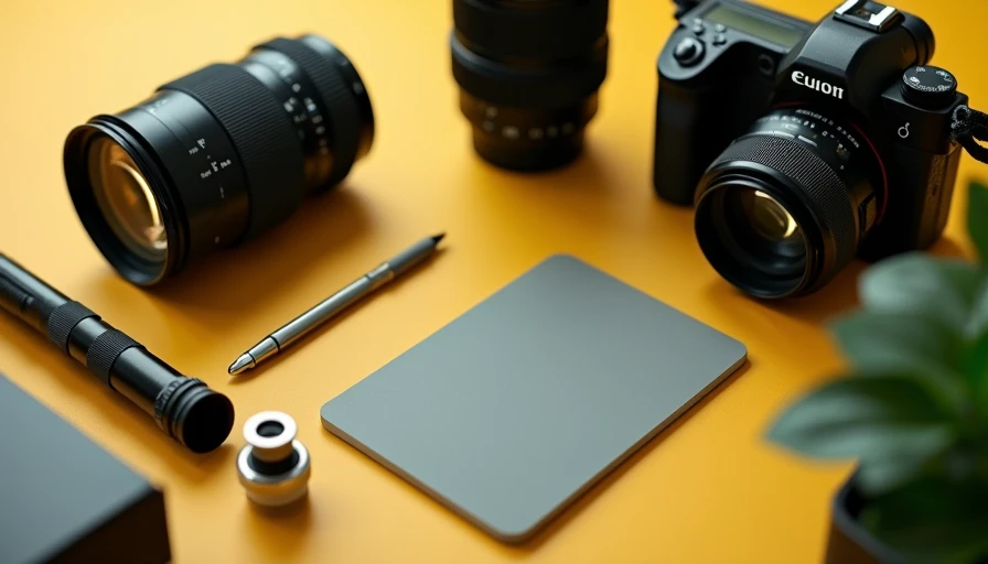
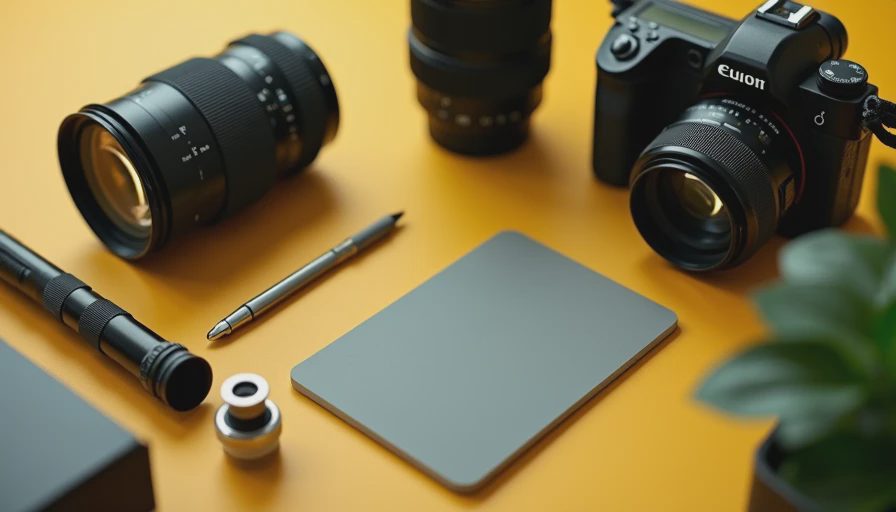
A gray card is one of the least glamorous tools in a camera bag, but it solves two problems that software often handles imperfectly: exposure and color. It is simply a carefully manufactured reference surface, usually close to 18 percent gray, that gives your camera or editing software a known target. I keep one near my light stand because it provides a dependable starting point when a white shirt, green wall, or bright window would confuse the meter.
The best camera is the one you understand, and the same principle applies to accessories. You do not need to memorize a ritual or buy the largest card available. You need to know what the card is measuring, where to place it, and when its result is more useful than your camera’s automatic settings.
What a gray card actually does
Your camera meter does not know that a scene contains a white dress, a black jacket, or a very reflective background. It tries to average the light toward a middle tone. In a normal landscape, that can work beautifully. In a portrait with a bright window behind the subject, it can produce an underexposed face. In a product photograph dominated by a dark bottle, it can push the exposure too bright.
A gray card gives the meter a controlled reference. Place it where your subject will be, angle it toward the light source, and fill enough of the frame with the card for a reading. The camera can then estimate an exposure that renders the reference as the intended middle tone. On a manual shoot, I can use that reading as a starting point and make small adjustments for creative intent.
The gray card can also help with white balance. Light has color, even when it looks neutral to your eyes. A cloudy sky, LED panel, tungsten bulb, and open shade each shift the color of a photograph. If you photograph the card under the same light as your subject, you can use that frame as a neutral reference in Lightroom, Capture One, or another editor.
How to use a gray card on location
Start before the important photographs, especially if the lighting is consistent. Ask your subject to hold the gray card at the position of the face or product. The card should face the main light, not necessarily the camera. If the light comes from a window on the left, rotate the card so it receives that window light just as the subject does.
Take one frame with the card filling much of the image. It does not need to be perfectly centered, but avoid glare, deep shadow, and a strong reflection from a colored surface. If you are photographing several people in the same setup, one reference frame is usually enough until the light changes. Take another whenever you move outdoors, change modifiers, switch rooms, or alter the power of a flash.
For exposure, you can spot-meter the card or use it to judge a test image. In manual mode, check the histogram and highlights rather than treating the reference as an unbreakable command. A technically correct reading can still be artistically wrong if you want a bright, airy portrait or a deliberately moody still life.
For color, import the reference frame and use the white-balance eyedropper on the gray surface. Then copy that temperature and tint adjustment to the other photographs made under the same light. This is much faster than correcting every image by eye, and it keeps a full gallery from drifting between green, blue, and orange tones.
Choosing the right card for your camera bag
Not every gray card is equally useful. A cheap card printed with ordinary ink may look gray but have a surface color that shifts under different light. For casual learning, a budget reference around $10 to $20 can be perfectly adequate. For paid product, portrait, or catalog work, I prefer a card or target with documented neutrality and a protective case.
Size matters more than people expect. A small gray card is easy to carry, but it can be difficult to fill the frame from several feet away. A card around 8 by 10 inches is a practical middle ground for portraits and tabletop work. A folding gray card is convenient for travel because it resists curling and fits into a lighting case without taking much space.
Some products include white and black surfaces alongside the gray reference. Those panels can help you inspect highlight and shadow limits, but they do not automatically make the product more accurate. Color targets with multiple colored patches are useful when you need repeatable color across a commercial workflow. They cost more because they provide more information, not because they magically improve every photograph.
Gray card, white balance card, or color target?
The names overlap, which causes unnecessary confusion. A gray card is primarily a neutral exposure and white-balance reference. A white-balance card is designed mainly to provide a neutral surface for color correction and may be brighter than a traditional 18 percent gray reference. A color target contains several known colors so you can create or check a more detailed camera profile.
For family photographs, travel, street work, and most personal projects, one reliable gray card is enough. For a product shoot where a small difference in a label color matters, a color target makes more sense. For video, a neutral reference is especially valuable because matching clips by eye can become tedious once lighting changes from one setup to another.
Do not photograph the card under one light and use it to correct images made under another. That is the most common workflow mistake I see. A perfect reference taken beside a window cannot accurately correct a subject lit by a warm lamp. The card must share the subject’s light, distance, and general angle.

Common mistakes that make the reference less useful
The first mistake is using a card that is dirty, faded, bent, or glossy. Fingerprints and reflected colors can influence the reading. Store it in a sleeve and replace it when the surface visibly changes. The second is tilting it toward the camera instead of the light. That can create glare or make the surface receive a different mix of light than the subject.
Another mistake is relying on automatic white balance after making a reference frame but never applying the reference during editing. The card only helps when it becomes part of a repeatable process. Photograph it, label the frame mentally or with a quick voice note, and use the same correction for the matching sequence.
Finally, do not expect a gray card to fix mixed lighting. If daylight enters from one side while a warm household bulb lights the other, there may be no single white-balance setting that makes both sources neutral. Turn off the competing light, add a matching gel, or separate the subject from the mixed sources before reaching for the card.
Is a gray card worth buying?
For less than the price of many memory cards, a gray card can save time and make your color corrections more consistent. It is particularly helpful for portraits, studio work, food photography, real estate interiors, and any assignment where several images need to match. It will not improve autofocus, increase dynamic range, or make a soft lens sharp. Its value is control, not spectacle.
If you mostly photograph spontaneous street scenes, you may rarely have time to use one. That is fine; a neutral reference is a workflow tool, not a requirement for taking good pictures. For planned sessions, though, I would rather carry a folding gray card than spend twenty minutes correcting a sequence that shifted green under inexpensive LED lighting.
Buy a size you will actually carry, test it under your normal lights, and learn one simple routine: place the card with the subject, make a reference frame, then photograph the scene. That small habit turns uncertain color into a manageable technical decision. Your camera does not need more accessories to become impressive. It needs a photographer who understands what each accessory is for.